Tuesday, January 11, 2011

Illustrators Drawing Illustrators

I was so excited to participate in Meagan's Illustrators Drawing Illustrators project, and then even more excited once I found out that I would be drawing her!


I decided to base my portrait off of some lovely photos we took together while we were getting ready for a fun, 60s themed Mad Men party. I thought the colors, especially her blonde hair with the red dress, were really beautiful and that Meagan herself looked gorgeous as well! I created the image using pastel pencils.

Everyone please check out her amazing blog! Meagan Morrison of Travel Write Draw

Thursday, December 23, 2010

Marie Antoinette

I wanted to take a break from sketch posting today to share one of my final drawings from my anatomy class this semester.


This was made using mostly pastels, with a little bit of charcoal and colored pencil added. I loved mixing the pale and dark blues with the pink in the skin. Overall, I think the end result really gives off a whole Marie Antoinette vibe, I think its the knee socks. All in all, I'm very proud of the end result!

-Jimmy

Wednesday, December 22, 2010

When You Were Young

I'm a bit behind on posting, so to make up for it I'm including two sketches in todays post :)

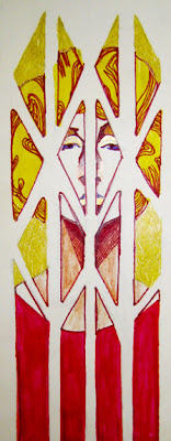
This first sketch originally began as a quick in-class portrait of my good friend Meagan (check her out at travelwritedraw.blogspot.com!) However, the following night I got a burst of inspiration after watching The Killers music video for "When You Were Young". I loved the saturated greens and reds that appeared throughout it. In addition, I've also always admired Gustav Klimt's work, so it also had a big influence in how this sketch turned out.


Overall, I think all these various inspirations melded together to create a vibrant drawing! Also, as you can probably tell, this served as inspiration when I was creating my new blog banner, I thought the small squares created a really eye-catching image.

Next, while reading the various movie blogs I frequent, I came across this striking screenshot from the fantastic movie The Grifters.


Again, I love the mix of green and red hues, and I thought the elevator doors could add a cool graphic element to a drawing. here's the result:


Happy Holidays everyone!

-Jimmy


Wednesday, December 15, 2010

Dog Days are Over


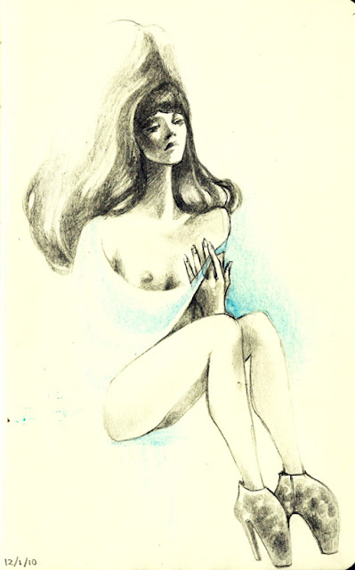
So todays sketch was done back on December 1st and is the first one I did in my new moleskine. I had a lot of fun with this one, the smooth paper of the sketchbook made it a pleasure to work with pencil. My original point of inspiration was Florence and the Machine's wonderful video for "The Dog Days are Over". I loved the blue, sixties-type girls that could be seen throughout, especially their amazingly huge hair!


Here's a picture of those groovy girls for some reference! I think I'll do a another piece where I explore that beautiful gold and blue combo they have going on.

Enjoy!

-Jimmy

Tuesday, December 14, 2010

Revamp

Haven't posted in a while, but now that fall semester and finals are winding down, I've decided to return my attention back to this blog. First on the agenda was a change in design. I've always loved color schemes that combine greens with reds and oranges. I'm sure a lot of it has to do with complimentary colors, etc. but it also just gives off a nostalgic feel that I like. This design is still in the beginning stages, but for now I am happy with it.

I recently purchased a great little moleskine sketchbook, so my idea from here on out is to try and do a sketch-a-day post. I've never been the best with keeping sketchbooks, so with this one I am determined to keep up with it and I think this blog will help with that!

Anyways thats all for now, expect posts soon :)

oh and just pasting this here so that I can connect with Bloglovin


Wednesday, September 22, 2010

Just the Beginning


So I for my first post, I figured I'd speak about the artwork I have featured in my banner! 


This was a class assignment I completed last year, at the end of second semester. The idea was to create a surreal glamour portrait inspired by one of the four seasons. Sounds fun right? I originally planned to go with spring, and became inspired by the Marc Jacobs Lola ads featuring Karlie Kloss lying in a bed of flowers. The ultimate result was this concept:


What I loved about this was how she was peaking through this dense bush of leaves, and thought the addition of the flower and bee in the foreground  gave the drawing a good sense of depth. However, the more I worked on this concept, the more disillusioned I became, and ultimately decided to start over from scratch the night before our sketches were due (of course). The final sketch was actually very close, but not quite the same as the final product. I moved away from spring and restarted with summer, creating this image of a woman with wild, coral reef hair. However, the sketch featured her on a beach buried in the sand, and it was my teacher who suggested to relocate her underwater and add some extra fish to the piece. And it was a good thing, because the change in location ended up giving the final product a very tranquil, ethereal feeling.

Plus! Here's a fun fact, a liquid matte medium was used to adhere sugar and crumpled bits of wheat thins to the paper, thereby giving the coral a very nice texture. And then when ink was applied to the sugar, it created these great organic shapes, and really brought the coral to life. The piece ended up smelling pretty sweet too ;)